Saturday, July 28, 2012

FILM 18: MINIMALISM / NOTHING / COLLINGS


Do you think that these artists made “something out of nothing”?
Yes, I do. Just because a canvas is plain white, does not mean that nothing is there and nothing is implied. It isn’t always about color and images. There’s texture to these paintings. The oil paints glob up and make texture that covers the canvas. Maybe that is what the artist intended.


What is the difference between pop art and minimal art? Does it make sense for these movements to follow one another?
Pop art was about visible things. Minimal art and conceptual art was about making things disappear. I think that it makes sense for these two movements to come after Pop art. Maybe artists were sick of “things” and wanted to make a bigger impact by painting “nothing”.


When people view minimalist paintings, why do you think they often get bored or frustrated?
People want answers. They want meaning.  When viewing minimalist art, it is often difficult to see what the artist is trying to say and therefore people, who do not like to think about the art they see, get frustrated.


Question: What is your take on Rothko’s Chapel?

FILM 17: LICHTENSTEIN / BRAGG


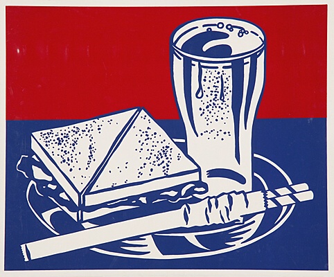
Lichtenstein uses a projector to project an image that he sketched onto the canvas. Then he traces the image onto the canvas. This was the case for his first pop painting, which was inspired by a cartoon on a bubble gum wrapper. He also uses inspiration from comic books and other advertisements. This method differs from Andy Warhol’s because Warhol often used silkscreen rather than tracing the image like Lichtenstein. This method is the same because they use projectors to reproduce already existing images rather than drawing the image themselves. I prefer Lichtenstein’s method because it seems like he puts more of his own touch into creating the paintings. I do like Warhol’s work as well, but Lichtenstein’s method is my favorite of the two.


In copying the famous paintings, Lichtenstein straightened out lines and changed colors and sizes. He also manipulated the images using the dot screen so to see how the famous paintings would look in different styles. These really aren’t even close to how Lichtenstein copied the comic books. You can see the direct correlation between the comic books and Lichtenstein’s work, while with the famous paintings it is more difficult to see how he copied the work. I prefer Lichtenstein’s reuse of comic books because like the style of the comic books. The huge images interest me and trying to figure out the themes of each painting is fun. I personally see no problem with Lichtenstein “copying” other artists in the way that he did because it wasn’t an exact replica. He made the image larger, painted it differently, and interpreted it to mean something new. It was no longer a single panel of a comic book. Lichtenstein gave it a bigger meaning. He was trying to say something with each carefully selected image that he painted. If it was an exact replica with no meaning, then it would be a different case.


Commercial artists are creating work that will be mass produced and distributed as advertisements or entertainment. “Fine” artists create one image and it is meant to convey meaning. These works are sold, but not always reproduced. One thing these two kinds of artists have in common is that they may be motivated by money. Both want people to like and purchase their work, even if they don’t admit it. The rules are different for each artist, though. “Fine” artists make their own rules. They do not have to follow guidelines or social norms if they don’t want to. Commercial artists must adapt to what the social norm is if they want to be appreciated. These rules are made by the client. A client in an ad agency or an author of a book may have rules for the images they want the artist to create. A curator of a museum could have influence on a fine artist, but ultimately the artist is the decision maker.


Question: Would you rather be a commercial or fine artist? Why?

Thursday, July 26, 2012

FILM 16: WARHOL / PBS


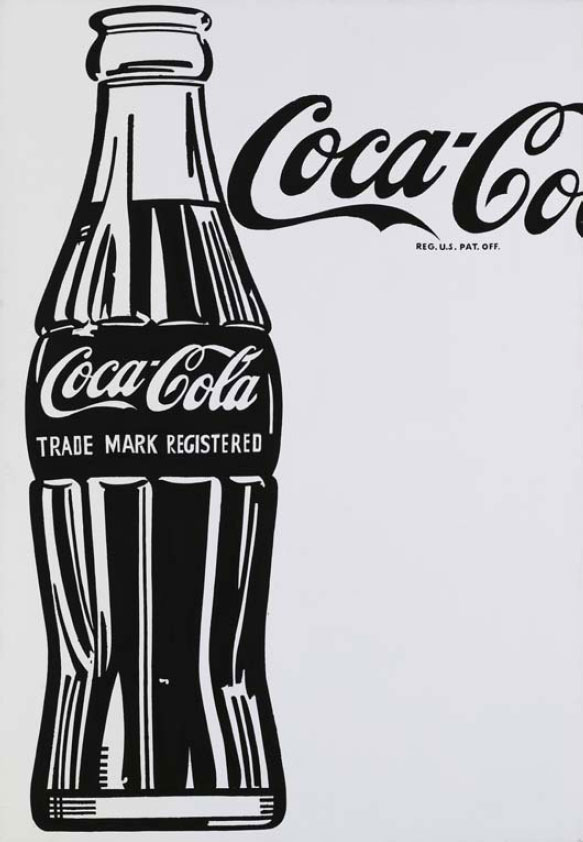
Warhol used a projector to trace images. He also used it to reproduce images. One Coca-Cola painting was “messy” and the other was “tight”. The messy version had brush marks and the other did not. His friends were invited over to view both versions and suggested that he continue with the tight version. I prefer the cleaner version because it is more visually appealing. Because I know it is Warhol’s style, I prefer it because I have already seen his work.


Muriel Latow suggested to paint the cans of soup. Warhol did numerous paintings but of different kinds of soup and in different positions and from different views. These paintings were first shown in California. I think these paintings are extremely revolutionary because they are of ordinary objects, but you look at each soup can in a different way than normal. That is really what art is about. I’m not quite sure if they are worth $100 million dollars, but they are definitely worth a lot.


Henry Geldzahler suggested Warhol painted Marilyn Monroe. The timing was significant because he began the paintings on the day Monroe died. These paintings were made differently than Warhol’s other work in the way that he first painted spaces where her face would be and then silkscreened a photograph of Monroe on top of the paint. This makes each Marilyn different because the ink started clogging the silkscreen after repeated use. I think Warhol was still making paintings because paint was still involved. Just because silkscreen was used does not mean it is not a painting. This, in my mind, is similar to other artists using the camera obscura in creating their work. It is simply a tool of an artist.


Question: If Andy’s childhood were different, do you think his art would have been different?

Saturday, July 21, 2012

FILM 15: POLLOCK / EVANS


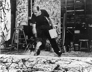
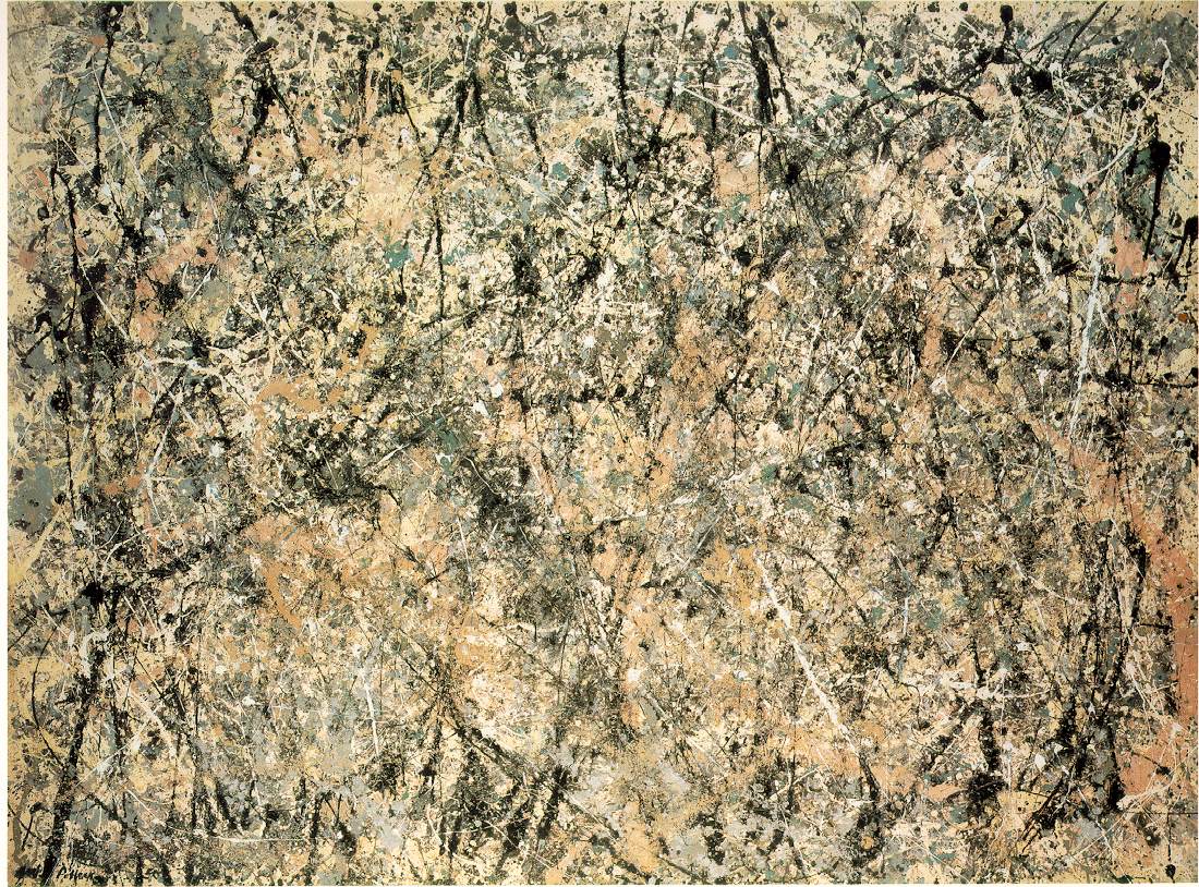
This film was different from the others in the way that we got an up close view of how the artist painted. In the movie about Dali, we saw him paint a little, but not the same way we saw Pollock paint in this film. Kim Evans delivered information in many different ways. Personally, I thought the most effective was the clip of Pollock painting on glass with a camera under it. It was truly very interesting to see the technique of painting he did. I would say that the interviews with Pollock were the next most effective way Evans delivered information, followed by interviews with other artists, images of Pollock’s paintings, and finally Pollock’s own narration.


When Patsy Southgate described a “Macho Modernist” she talked of men whose manhoods were threatened because of the fact that they were creating art instead of settling down with a family like many other men were doing after World War II. They were doing something “delicate” and therefore had to overcompensate by being macho. These men drank a lot and lived dangerously. They were constantly drunk and partying. Often, they drank and drove. They were strong, ugly men who ended up becoming alcoholics and fighting bouts of depression. I personally find this overcompensation and lifestyle interesting, but also slightly frightening. They put their lives in danger because they felt like what they were doing wasn’t man enough. This is all very unfortunate. However, I truly enjoy Pollock’s artwork, and I feel like if he weren’t trying to be “macho” it wouldn’t be quite the same.


Peggy Guggenheim was a patron of Pollock’s art. She was one of the first people to show and commission artwork from Pollock. Clement Greenberg was an art critic who was one of the very first people to publish work that praised Pollock’s art. Lee Krasner was an artist who later became Jackson Pollock’s wife. Hans Namuth filmed Pollock painting from under a sheet of glass. This filming caused a lot of tension for Pollock which ended up causing him to drink again. He was losing inspiration and though Pollock wanted to move forward, he could not figure out how. Overall, this film impacted Pollock in a way that would change him and his art forever - and not in a positive way.


Question: Do you think Pollock was correct when he thought that the unconscious is where art comes from?

Thursday, July 19, 2012

FILM 14: DALI / LOW


The biggest difference in this film is that there are interviews and other videos that are of Dali. No other artist we have focused on has been interviewed like Dali is in this film. These videos gave an even better and more credible insight into the life of Dali. Adam Low used many other strategies to deliver information about Dali. Some include: news reports about Dali, interviews with other people, book excerpts, narration, and finally examples of paintings. In my opinion, the book excerpts were the most effective, followed by the interviews with Dali, the narration, the other interviews, examples of paintings, and finally the narration. I found the excerpts from Dali’s book to be the most effective and interesting because as the narrator talked about Dali, the book backed up the information.

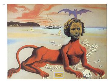
Dali’s “Shirley Temple, The Youngest, Most Sacred Monster of the Cinema in Her Time” is the most interesting painting from this film. In my eyes, it is different from most of Dali’s other paintings based on the subject. I would have not expected something including Shirley Temple to be done by Dali. This painting was created using gouache, pastel, and collage on cardboard. The first thing I see is the red body that Shirley Temple’s head has been attached to. It seems to be part human, part monster. The red color really catches your eye along with the muscle and claws. Next, I see Shirley’s head which seems to be glued on the cardboard. The color does not match the rest of her “body” so that makes it interesting. Her facial expression oddly goes with the pose. Dali’s message is unclear to me, but according to Wikipedia, many sources believe that it is “a satire of the sexualization of child stars by Hollywood”.


The way that Andre Breton, Man Ray, Marcel Duchamp and Dali worked together in Paris was surreal. This changes the way that art and artists interact because it is like the artist is living the art he or she is creating. They are closer. The audience, however, may be distanced from the art because they may not be able to relate to how the artist was feeling or acting when they created such art. This kind of painting is acceptable, but many people might not understand it. People might think it to be odd and they might not like the artwork, but this does not mean it is unacceptable. The irrational way in which these artists lived is interesting for sure, but once again might not make sense to outsiders. While I’m sure it made perfect sense to Dali and the other men, people just might find it unacceptable. They were doing no harm, so there is no reason to consider their way of life unacceptable.


Question: What do you think of Dali’s collaboration with Alfred Hitchcock?


FILM 13: PICASSO / BRAQUE / GLIMCHER


“Picasso & Braque go to the Movies” is unlike the other films we have watched thus far. First off, this film talked about the influence of cinema on painting, rather than just photography. The film had clips of very old movies that inspired Picasso and Braque. Also, those who were interviewed were film makers, critics, historians, and artists. There was no single host of the show like all of the other films we have viewed thus far. These qualities along with a great topic create a very interesting film. So far, this is my favorite film we have viewed. The five most effective ways that Arne Glimcher delivers information in this film are through interviews, old film clips, paintings by Picasso and Braque, the work of those interviewed in the film, and comparisons of Picasso and Braque. I found the interviews most effective followed by the old film clips, paintings by Picasso and Braque, the comparison between Picasso and Braque’s artwork, and finally the work of the artists interviewed in the film.


The “mountain climbers” are Picasso and Braque. A poet named Guillaume Apollinaire introduced the two artists. They worked together, but on separate paintings. It was said that Picasso did not finish a single painting without Braque looking at it first and vice versa. This story is unlike anything we have seen thus far because instead of two artists competing, Picasso and Braque are working together like a team of mountain climbers. Da Vinci and Michelangelo are compared and contrasted and considered competitors. Goya and David were weighed against one another. Picasso and Braque complimented each other.


Martin Scorsese is an award winning and world renowned film maker known for his use of film rather than digital. Chuck Close is an artist known for his photorealist works (Wikipedia). Julian Schnabel is both an artist and a filmmaker. Eric Fischl and Lucas Samaras are both artists as well. All of these artists are interviewed in the film and provide insight about numerous aspects of cubism and cinema. Many of these men are inspired by early cinema or cubism. Also, many of these artists are pioneers in their respective fields. In my opinion, Martin Scorsese’s final words in the film gave the most insight. He stated that Picasso and Braque tore “down the conventions of representation”. These two men did not stick with the norm and paint exactly what they saw. They changed the art world and put their own spin on things. Scorsese also said that “cubism is not a style, it was a revolution that instigated a profoundly radical change of artistic form. In fact...a radical change of vision itself.” These words helped me understand cubism even more. It makes much more sense now. Before, I looked at cubism and thought that it was weird and hard to understand. Now, I realize that when you piece each section together and see what the artist is saying, it really is just a different, more interesting way of looking at something rather simple.


Question: Do you enjoy the fact that these two artists produced paintings that look a lot alike? Or does this bother you?

Saturday, July 14, 2012

FILM 12: IMPRESSIONISM / COLLINGS


I prefer last week’s video by Collings because I found the David and Goya comparisons much more interesting. Both videos were presented in a similar way, but it was simply the content of last week’s video that was more interesting to me. The most interesting thing that Collings said this week was that impressionists thought that “art should be real, not false”. I found this interesting because of its truth. When you look at impressionist paintings, nothing is beautified like much of the art we have looked at. It is simply an image of what the artist sees. It is honest and sometimes flawed, but never embellished.


In my opinion, all of the paintings featured in the film are exceptional, but one that I was unfamiliar with was my favorite. Paul Cezanne’s “Mont Sainte Victoire” series was painted in the 1880s using oil paint. These paintings are extremely eye catching. The vibrant colors and the slightly messy brushstrokes make your eye jump all over the canvas. The first thing I notice is the mountain and then I notice the trees in each scene. My favorite of the series is the photo I included. I like this one the most because of the bright colors and the way the trees are painted. These scenes of mountains in France are truly some of Cezanne’s most exceptional work.


Realism was the type of art that preceded impressionism. This art was very much straightforward and slightly boring. The work was as close to reality as the artist could get. Impressionism, on the other hand, painted in an almost messy way with small, quick brushstrokes and when you look closely at the scene, it is not realistic. These paintings are much more pleasing to the eye and were often of beautiful scenes or people outdoors enjoying themselves. I think that the impressionist movement is a step in a positive direction because art does not have to be perfect or exactly how the subject matter appears in real life. I enjoy art that is more of an interpretation of what the artist sees rather than an exact replica of a scene. Impressionism does just that, and for this reason I believe that art was definitely moving in the right direction. These paintings are most definitely “nice”, as Collings said. The softer colors, brushstrokes, and beautiful scenery are what contributes to the overall niceness of impressionism.


Question: Do you prefer realism or impressionism?